Board Game Icons
I spent some time studying icons from various board games. In particular, games that Ian O’Toole worked on, like Galactic Cruise, RA, and Voidfall. This is what I learned.
Component Icons
Most actions and effects are fundamentally just moving a component around. When the icon depicts this action directly, it becomes easier to understand. Start with a literal depiction of your components and then layer in motion.
To represent a cube, you can shade three sections of a hexagon.
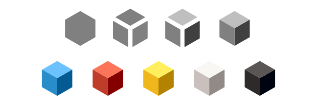
Another common component are the colored silhouette shapes made from either wood or acrylic, some with screen printing. For these, you can use the silhouette as the icon.
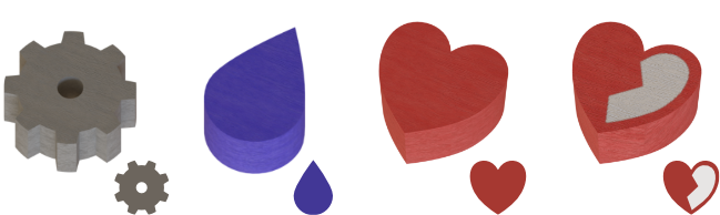
For a “wild” resource, you might be able to merge the constituent resources into one. This is often done with a pie-wheel or with bands of colors.
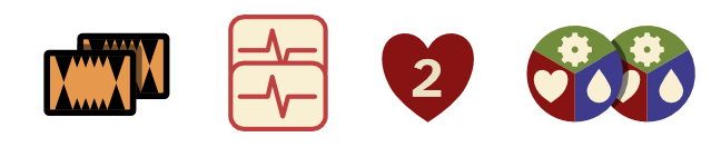
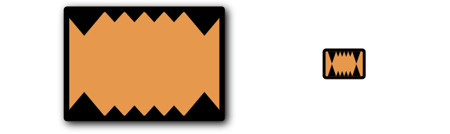
For cards or tokens with dynamic elements, like artwork or ability text, you only need to represent the common elements of your components, like the card’s back or the card’s frame.
You can use arrows to convey an action or effect.
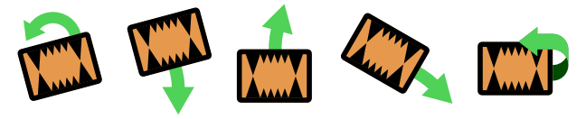
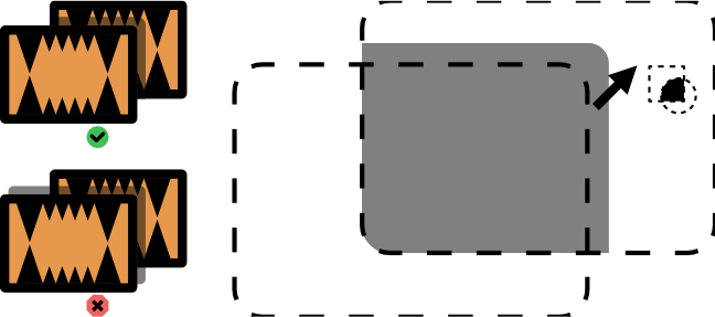
Rotate a component slightly to show that it shouldn’t be in the depicted location, like in the case of a card that you need to discard.
For movement in the third dimension, like flipping a card over, use a three dimensional ribbon arrow, rather than a flat arrow. This helps sell the motion and distinguishes it from rotation.

For gaining or losing tokens from your personal supply, use a plus or minus sign.

To depict specific quantities of a component, you can place a number inside the icon or duplicate the icon, depending on how big the quantities can get.
Shadows are a convenient excuse to add a boundary between distinct elements. Shadows aren’t always necessary, but when you do have them, only cast them on the other components; not on the page behind.
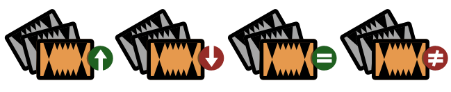
To depict an unspecified amount of “many” components, show a line of components fading away, a stack of components, or several components splayed out.

You can then add symbols to represent “most”, “least”, “matching”, or “distinct”.
If an event triggers an effect, use a colon to separate the event on the left from the effect on the right, as in, when left happens, do right thing. An × generally means to multiply the left thing by the number of right things, as in “left per right”.

For “income”, you can use an extended hand. This may not work with all themes though.

Note that we’re getting dangerously close to ripping off Galactic Cruise entirely. I don’t think I would use all of these in one game, but it’s a helpful collection to borrow from.
Credit
I derived these hands from an icon found on http://game-icons.net.
Players
The best way to depict players is with a floating circular head.
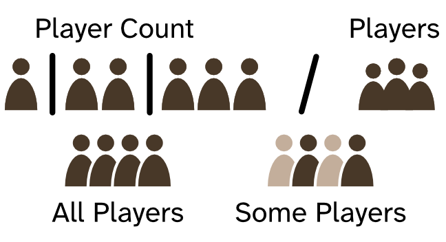
This distinguishes “player” from “component”, as components can’t have disconnected pieces.
Cycle and Reset
I’ve noticed that “cycling” through something tends to use circular arrows pointing at each other. Galactic Cruise uses a similar icon for resetting a market, though, where two bent arrows point past each other. This differentiates it from a “cycle”, which to me would imply that you always refresh the market.

Player Colors
You want to distinguish between components by shape or screen printed design as much as possible, even when it comes to player pieces. Sometimes, however, this isn’t an option, like when using wood cubes. For this, use colors that are easy to distinguish, even with color blindness.
Here’s five workers I put together with colors that, as far as I can tell, should be easy enough to distinguish by players with color blindness. The colors are given as Pantone codes.

I haven’t tested these colors with real people, however, as that would require me to manufacture a physical version, so take this part with a grain of salt. (If there is already a color-blind-safe Pantone coated color palette, reach out, because I couldn’t find one.)